Get a proposal from Pappa
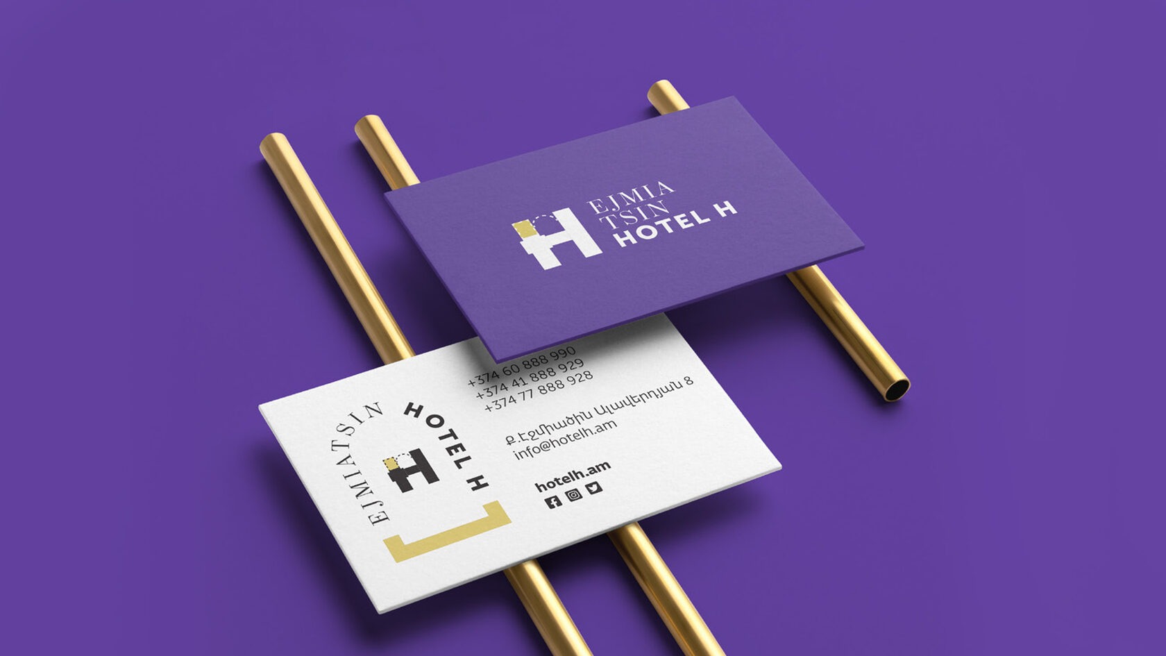

HOTEL H
HOTEL H
CLIENT
Hotel H
WORK TYPE
Visual Identity
PROJECT TEAM
Anna Margaryan
Astghik Margaryan
Gayane Yengibaryan
Lily Badasyan
Astghik Margaryan
Gayane Yengibaryan
Lily Badasyan
COLLABORATORS
Hotel H
CLIENT
Hotel H
WORK TYPE
Visual Identity
PROJECT TEAM
Anna Margaryan
Astghik Margaryan
Gayane Yengibaryan
Lily Badasyan
Astghik Margaryan
Gayane Yengibaryan
Lily Badasyan
COLLABORATORS
Hotel H
BRAND
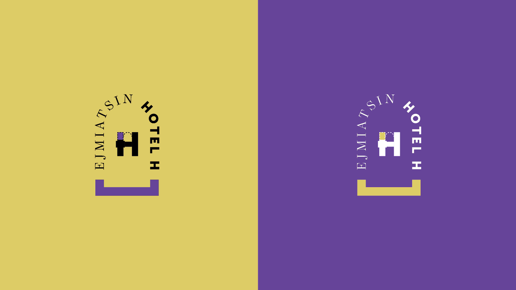
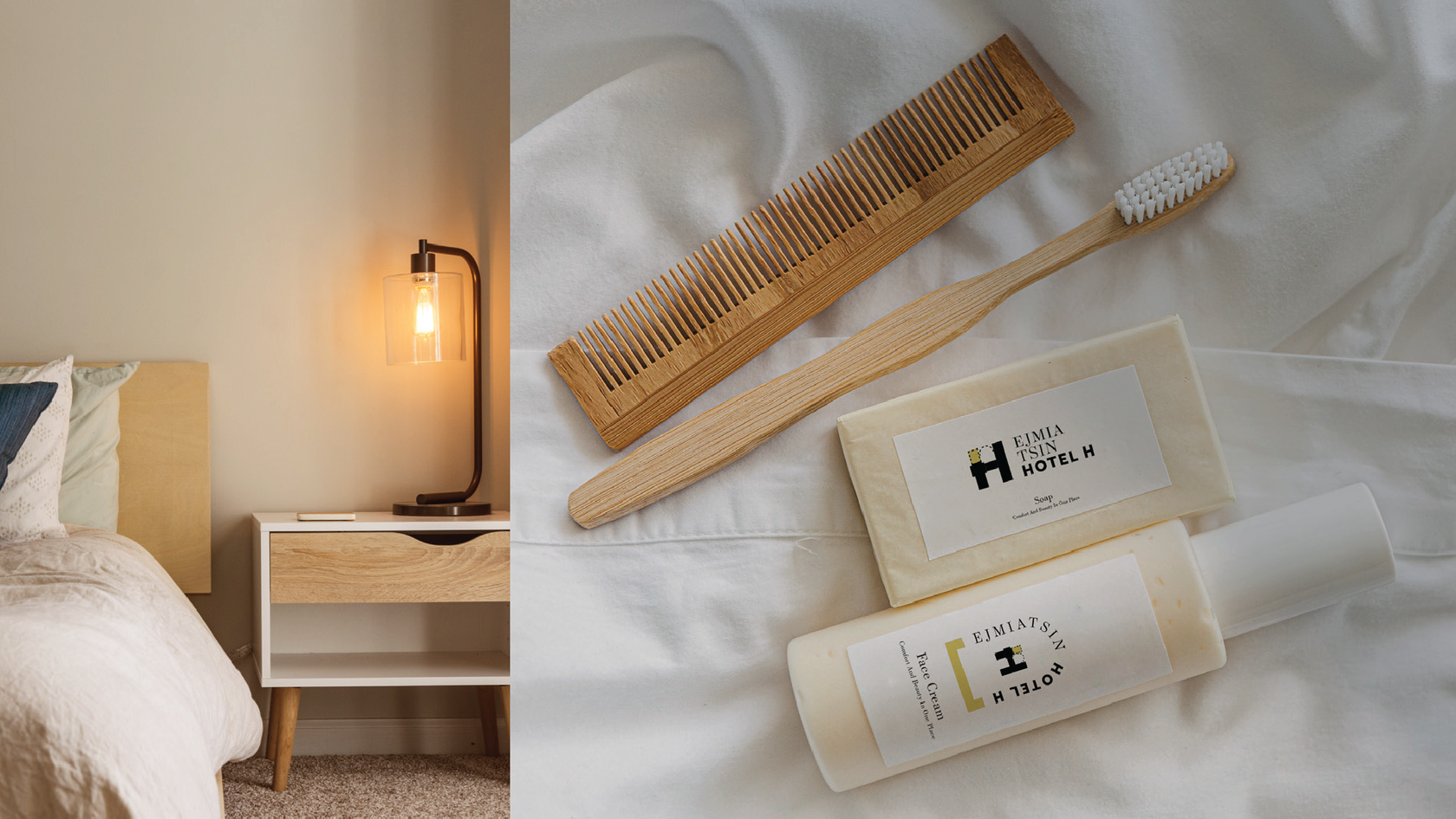
H Hotel and Restaurant is a comfortable hotel and delicious restaurant in the heart of Etchmiadzin.
CHALLENGE
Our objective was to create a visual identity from scratch by giving a fresh breath yet keeping the historical feel of the identity.
RESULT
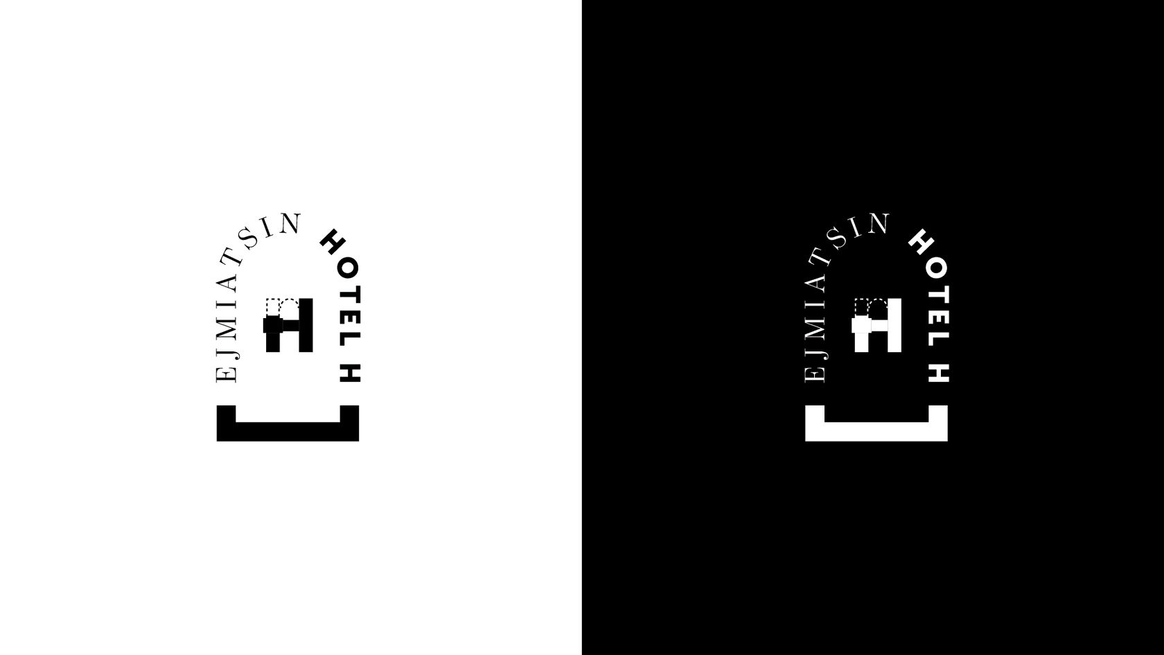
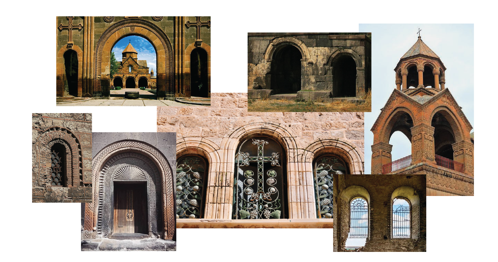
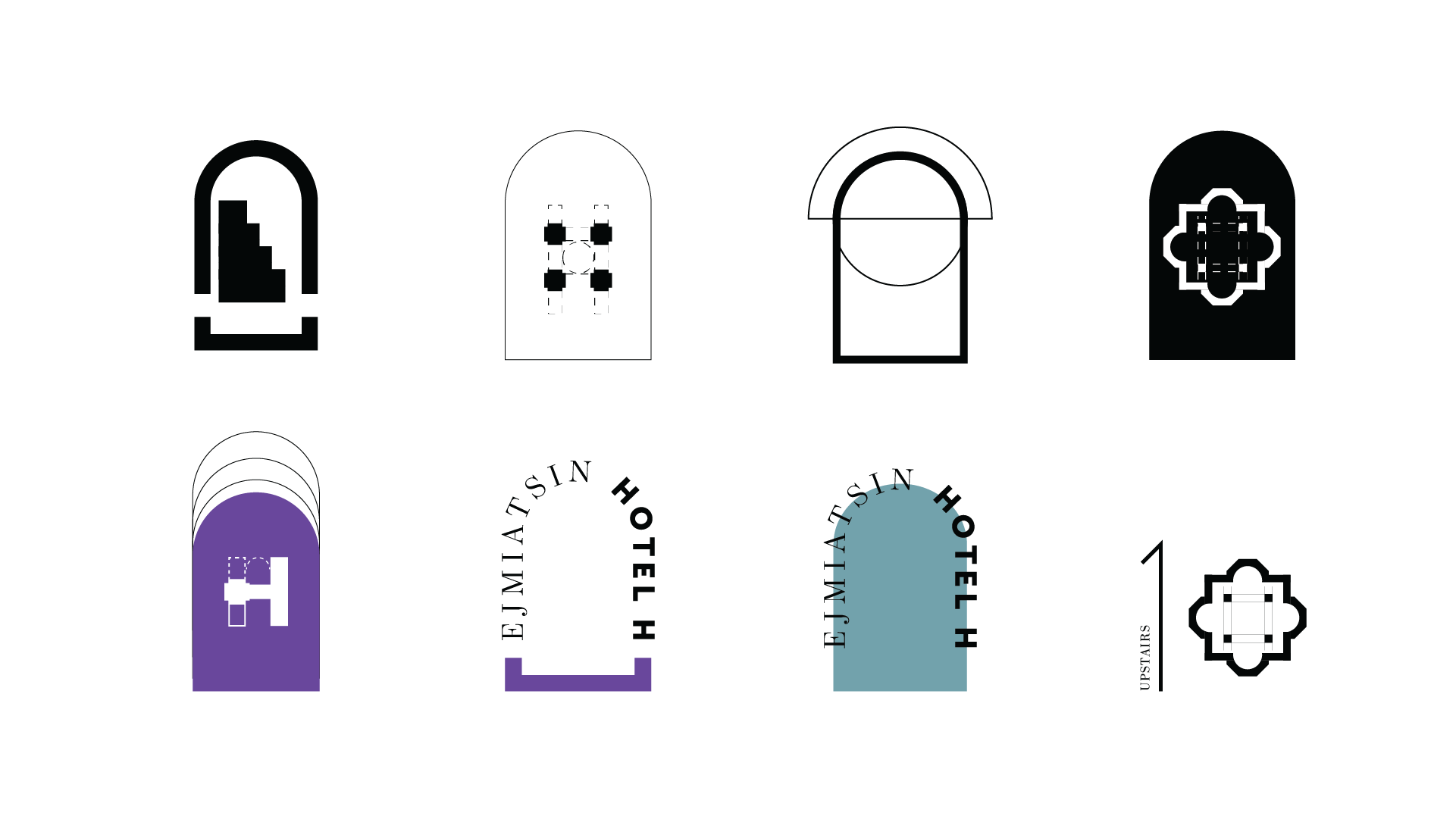
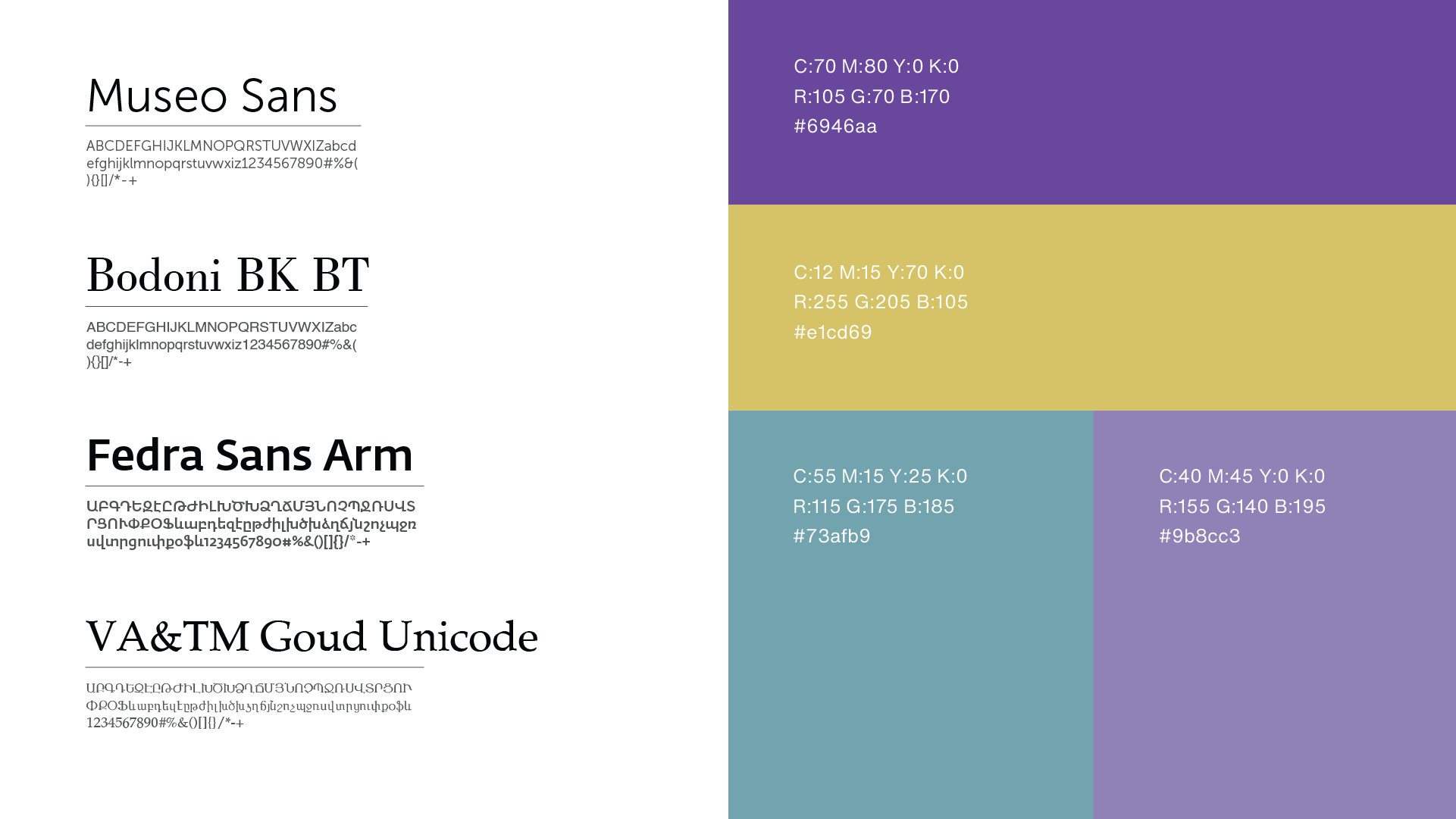
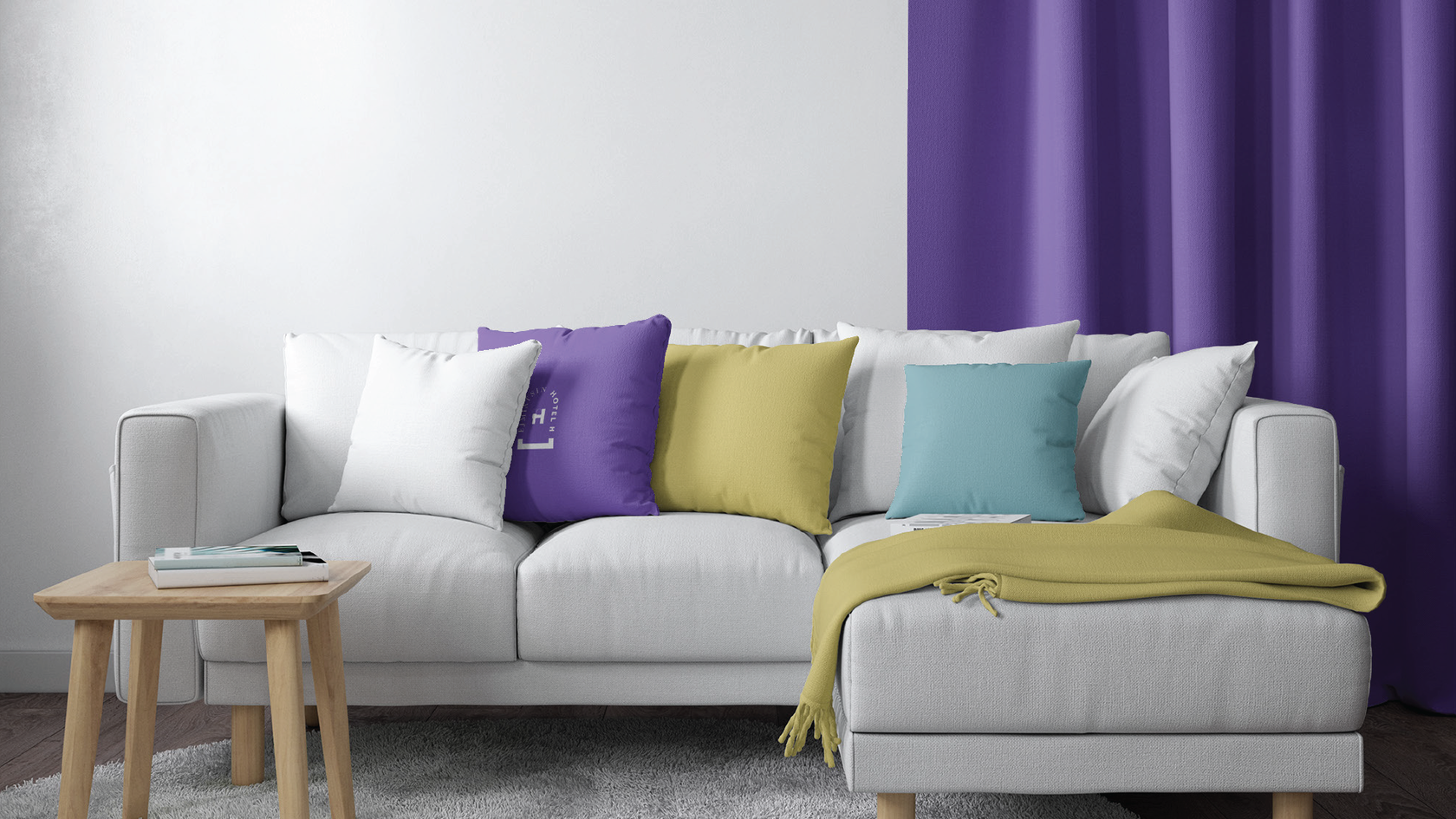
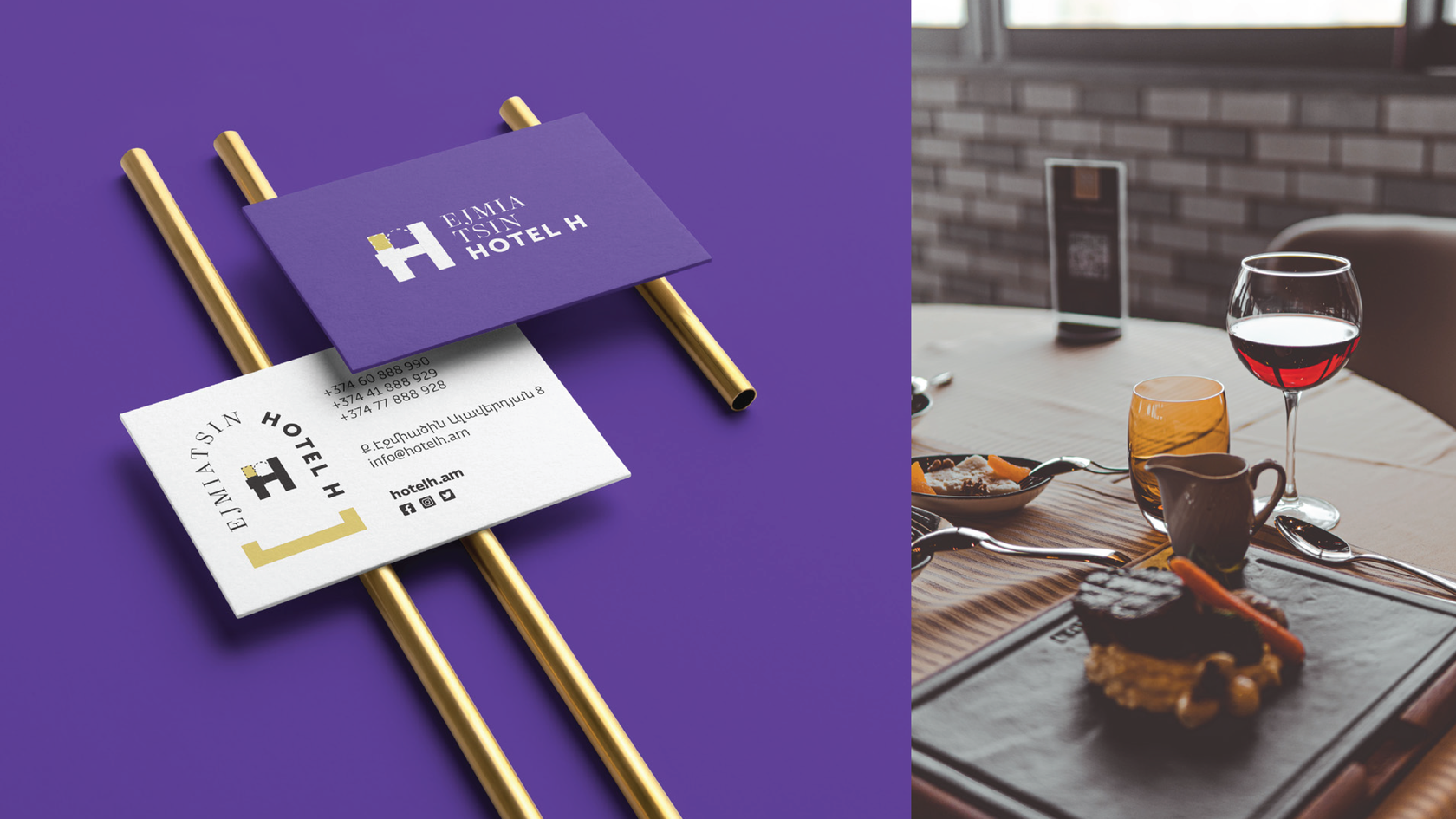
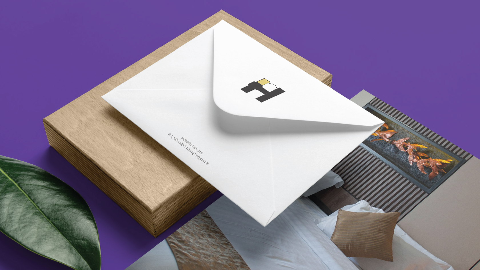
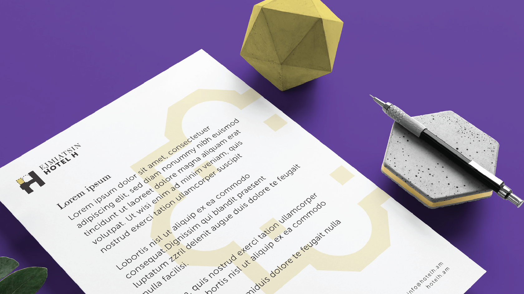
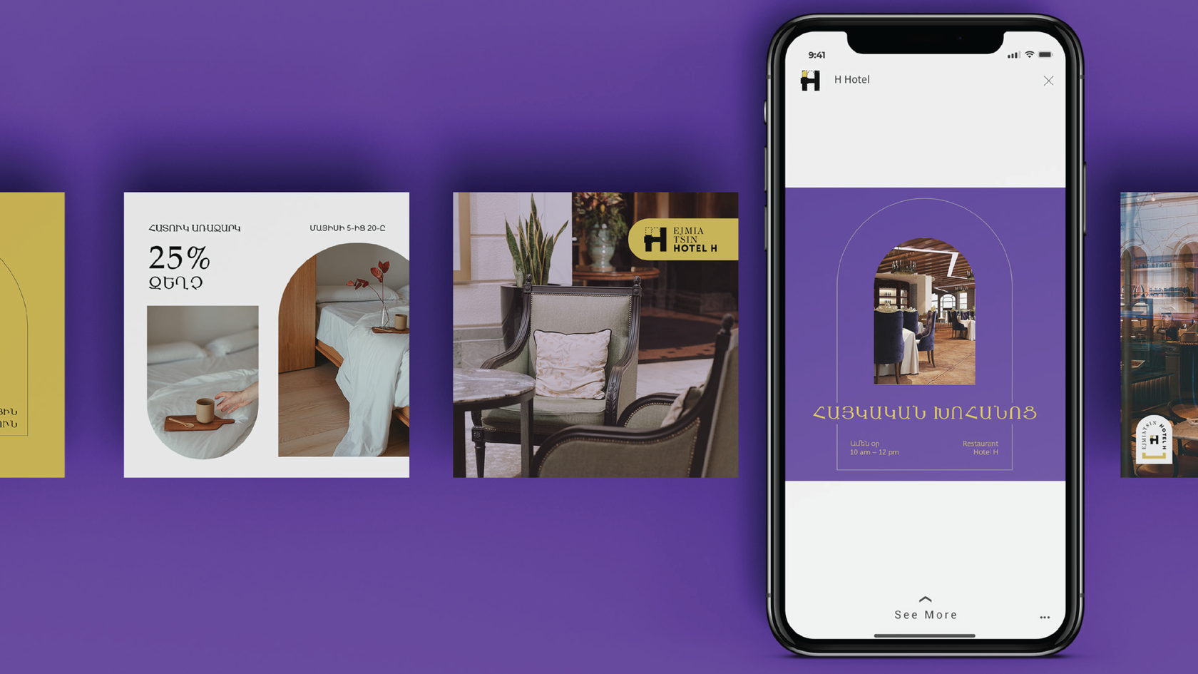
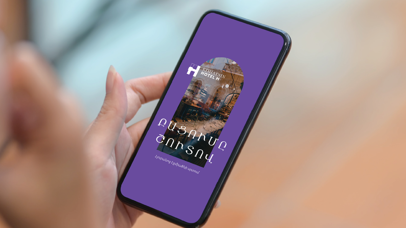
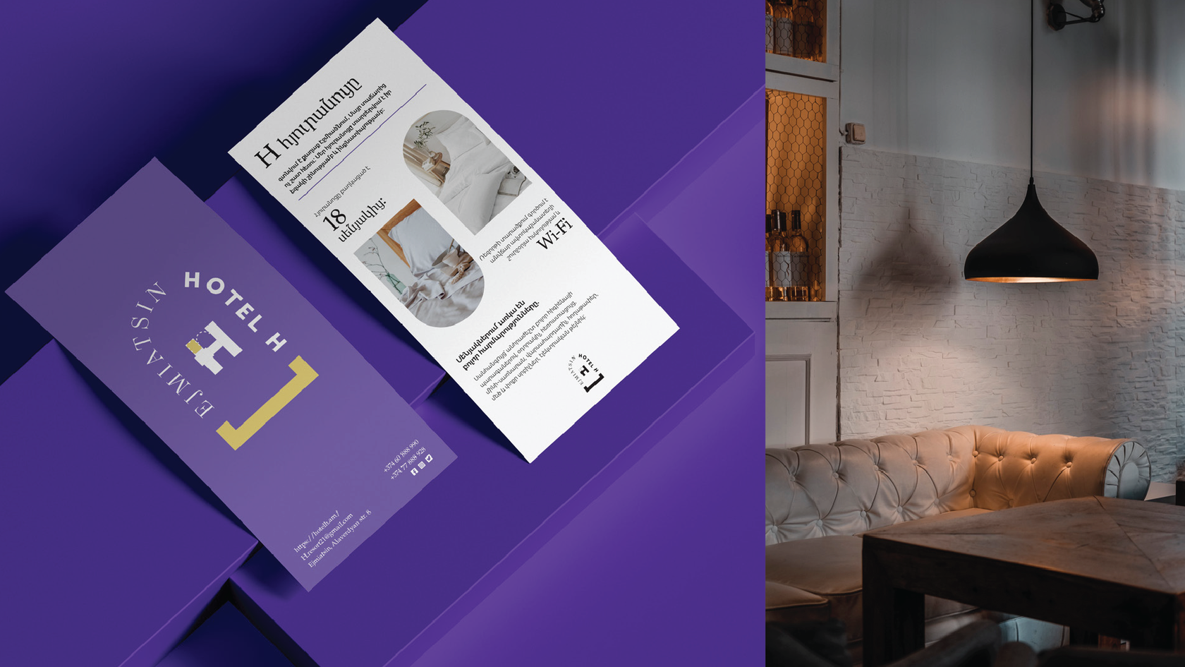
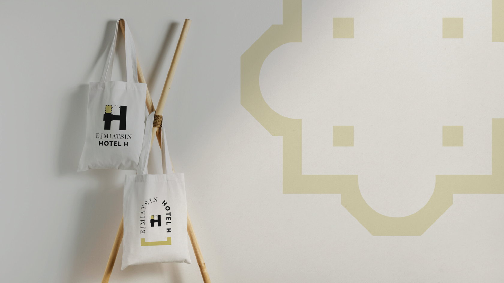
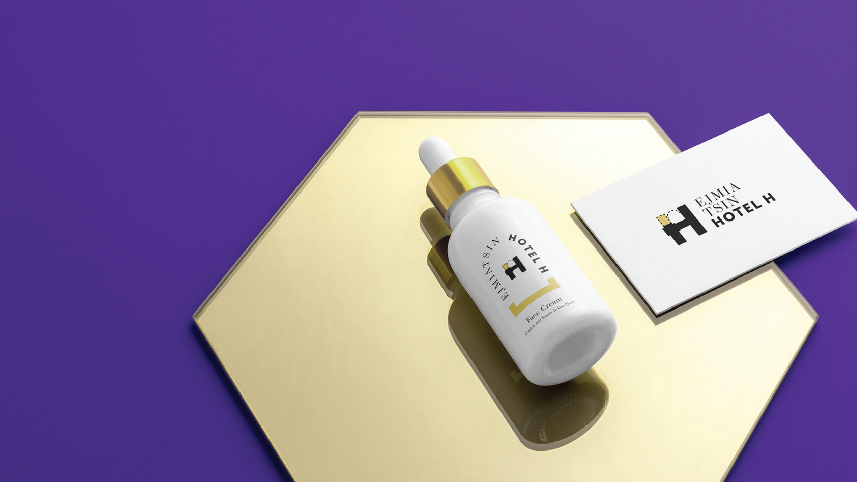
Starting off the project, we created a logotype that would convey the historical yet modern feeling. For that, we used ecclesiastical elements like the arch that represents the ones used in building churches. The concept of the arch was later used in different variations of the logotype. Other similar brand elements that were used are the church window forms, the staircase, and other elements that became the basis for the whole visual identity creation. When it came to the brand colors, we chose colors that were both modern and conveyed the historical spirit. Overall, we created an identity that holds old heritage vibes but at the same time is somehow fresh.